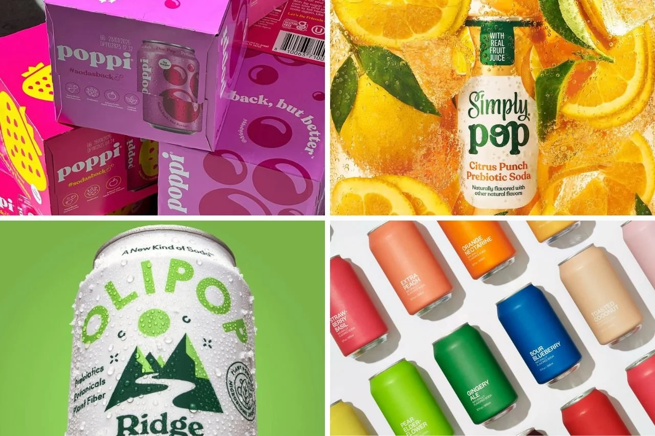
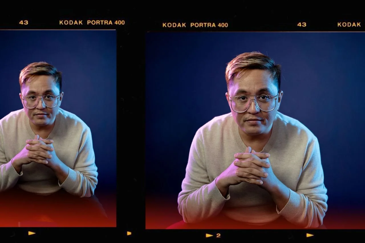
Apple iOS icons are a professional touch.
Recently, HubSpot’s Website Grader began factoring mobile optimization in to its scores. After all, it’s about time for mobile platforms to be considered in the production of every website, as more people are owning smartphones. This doesn’t mean making a completely new version of the website built just for mobile. There are three essential steps, though, that should be followed during website production.
Build CSS for Mobile
Websites tend to have multiple stylesheets already – screen, print, IE-only, etc. – and adding one more can’t hurt. Setting up a special CSS stylesheet for mobile-only. This allows webmasters to define how the website shows up on touch-screen devices, and allows it to be more streamlined and load faster for mobile devices. You can even define separate styles for iOS and non-iOS devices.
Futher reading: Optimizing Your Website For Mobile
Implement Meta Tags
If you think you have a lot of stylesheets, you probably have even more meta tags. But is “viewport” one of those? The meta viewport tag is simple – it defines if the user can scale a website larger or smaller, or if it should rotate along with the device. For example, if a website has been built to be the exact width and size of a mobile screen, it’s unlikely that the users will need to zoom in and out.
Further reading: Using The Viewport Tag
Don’t Hide The Non-Mobile Site
If the mobile version of the website differs significantly from the “full” version, include a link to go to the non-mobile site. Countless websites will force the user to a terrible mobile version that doesn’t provide the same functionality as the full version. This can especially be a pain on tablets, where the screen can be almost as big as a traditional laptop. Including a quick link to disable the mobile version is essential.
Use Apple iOS Icons
Most people aren’t even aware of this, but it’s a nice touch that adds a new level of detail to a web project. iOS allows any website to be added to the home screen springboard by simply clicking a button in the browser. If no icon is defined, then an icon is created using a screenshot of the page you’re on, which can result in an ugly icon. According to The Register and Net Applications, iOS devices make up for two-thirds of all mobile web browsing, so a small touch such as this could greatly benefit those users and make them more likely to come back.
Further reading: Apple Touch Icons
Un-Flash Your Website
Flash is fine for desktops and laptops, so keep it there. But, it won’t show up at all on iOS devices, and can slow down Android phones. An alternative needs to be considered for mobile phones. Either hide that Flash element altogether, or replace its functionality using HTML – especially if the functionality is vital. Almost all mobile browsers now support HTML5 and Javascript, which can work similarly to Flash elements if needed.


